Exercise from home with a little help from your friends
- Product Design
- Graphic Design
- Animation
- UX
- UI
Tools Used
- Figma
- Miro
- After Effects
- Illustrator
Jump to
Language
Prototype
Introduction
A few months ago, I joined a workgroup created by Píldoras UX to create an app from a stakeholder provided by the company, being there a unique opportunity to create a product based on the needs and frustrations of a business in times of pandemic.
UX Research
Understanding the challenge
Prior to the interview with the stakeholder, we analyzed as a group all the information available online about the business on its website (mujerydeporte40) and social networks. We verify that her business currently focuses on exercises and healthy habits for women over 40 years old, her main activities being online classes, face-to-face meetings, as well as advice on nutrition and health. In addition, it has a store where you can buy merchandising or previously recorded classes.
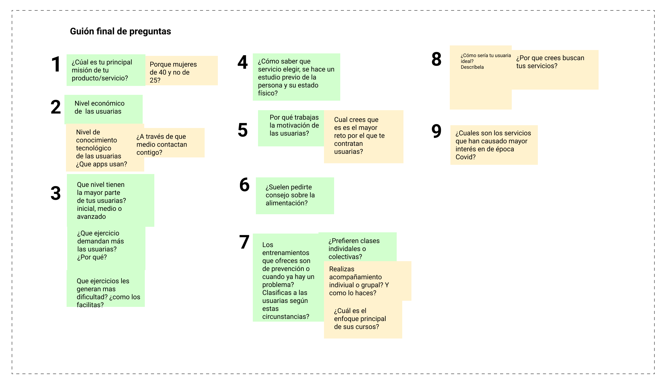
We structure the information on your website in various keywords to later organize it into two blocks, “services” and “users”. In this way, we build a script with key questions about her business, followed by a brainstorming session to create other questions, and thus, get more specific information regarding the needs and frustrations that she observes in her clients and that currently affect the customer. deal.
Stakeholder interview
Divided into 9 thematic blocks and with 16 questions in total, we set out to find out if some of our hypotheses about its users and business were true.
Interview insights
With these insights we can draw the following conclusions:
- They have a medium-low technological level, but they know and access the business through Instagram.
- They look for classes to exercise, but what keeps them going is socializing with other people.
- Although it is difficult for them to access Zoom, they know how to use social networks and simple apps at the usability level.
- Users tend to propose exercises, inclining to perform those with a lower level of intensity.
- Exercises related to the climacteric stage (gymnastics, elasticity, pelvic floor) are the most demanded.
Proto-persona
By not having user data through interviews or surveys, I designed a proto-persona based on the characteristics that we could grasp with the data provided by the stakeholder, focusing on key needs and frustrations.
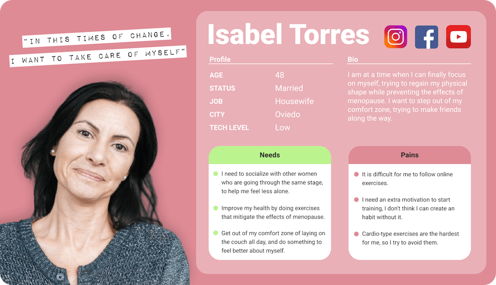
I defined Isabel as a 48-year-old woman who, due to the pandemic, has lost motivation and is stuck in monotony; despite the fact that she wants to take care of herself at this vital stage and take her lifestyle more seriously.
Above all, she seeks to connect with other women in a similar situation, which also helps her create the habit of exercising.
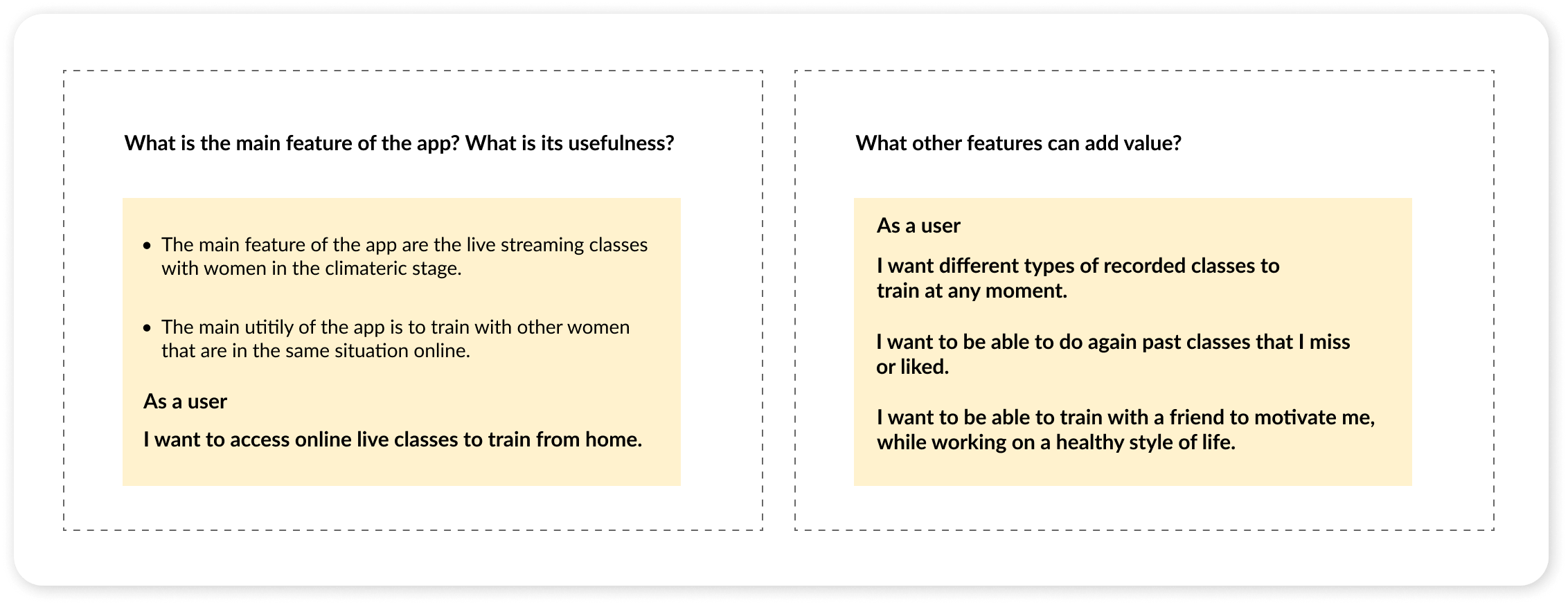
MVP
Before continuing with the development, I clearly established the main function and utility of the app: live classes with women in the climacteric stage and being able to exercise from home with other women. I also devised other requirements that I had to meet to add value to users.
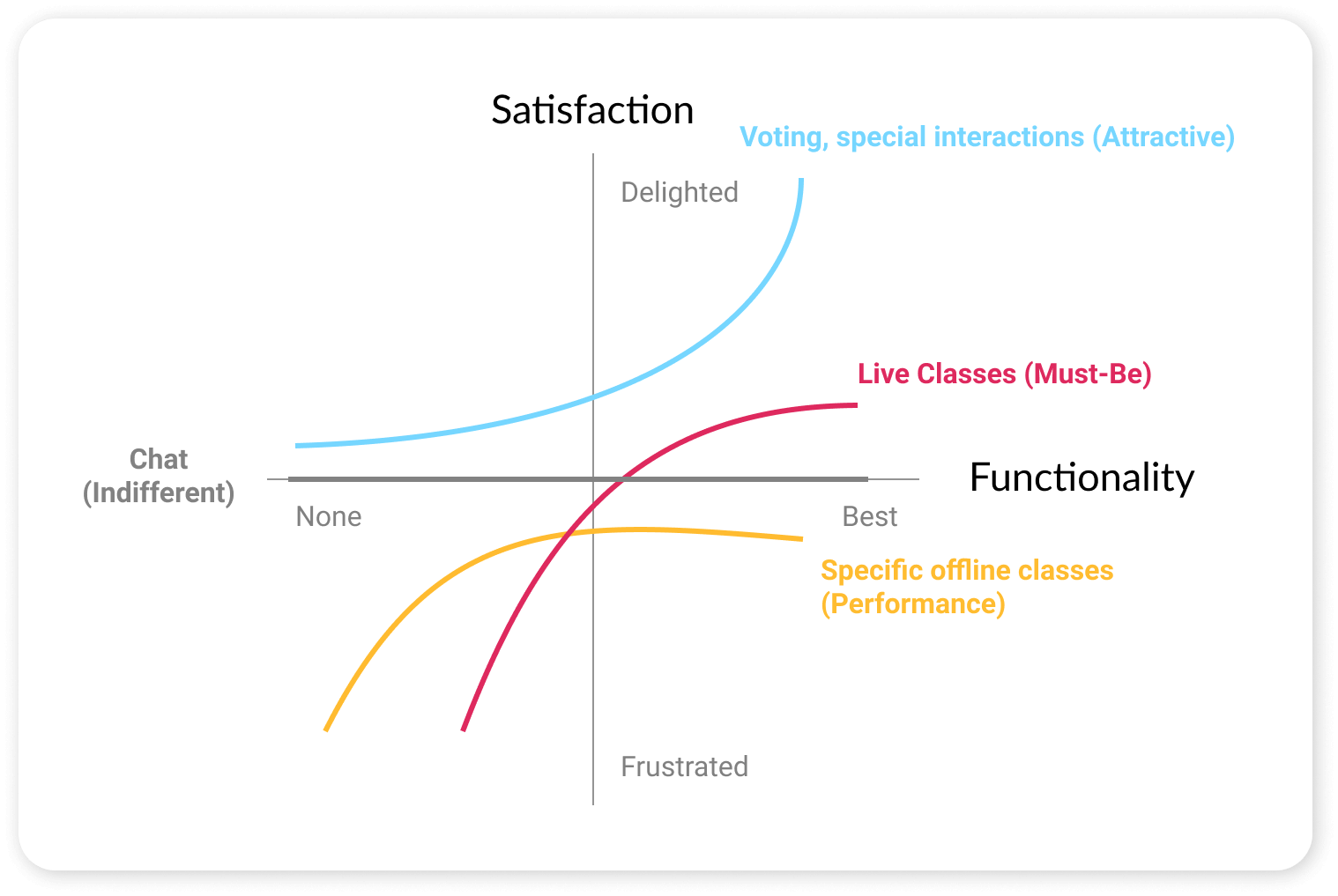
Kano Model
Next, I used the Kano model to check where the main features I had in mind should reside within the “satisfaction” and “functionality” axes, in order to take into account for the future, what details need to be prioritized and refined.
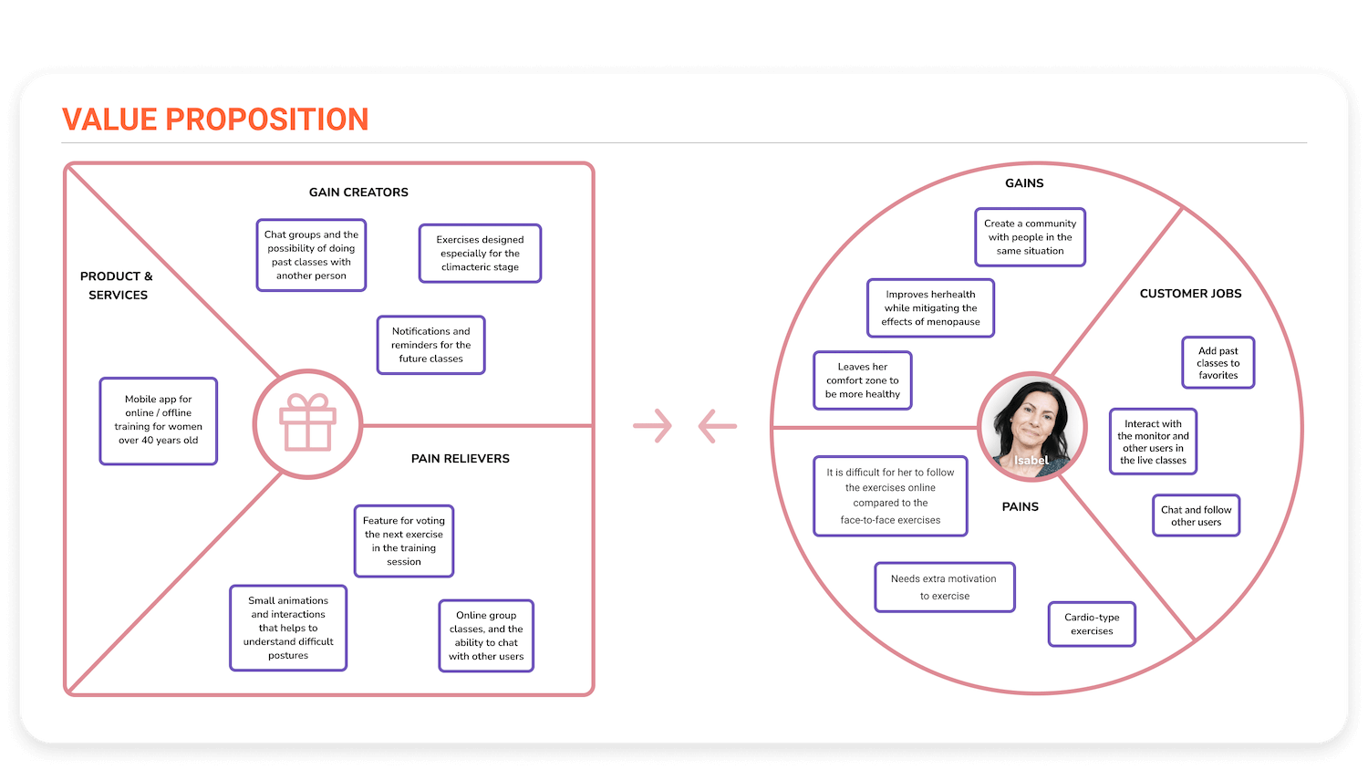
Value proposition
Having resolved already the main functionalities, I made the value proposition of my product, matching the frustrations with the characteristics that can alleviate these barriers. An example of this is, are the collective classes with other women or friends, which motivates her to exercise. In addition, it helped me to better balance the advantages that the product could provide along with the benefits that users can acquire from the app (such as leaving their comfort zone and socializing while exercising).
Customer journey
Once I had the needs and frustrations of the proto-persona, the functionalities that my product could offer, and how they fit with what the user needs and benefits, I started to develop the Customer Journey. I described the problems and insights that our user goes through in the different phases, in addition to the actions that she usually performs, to contrast it with Use cases that could work.

In the first phase, we see that the user can’t find an app with streaming classes as well as specific exercises.
Upon discovering the app and its functionalities, the user is once again active and surprised by the different possibilities it offers, some of them impossible to replicate in a physical environment.
But, after assiduously skipping her classes, she realizes that she still needs someone by her side to give her support and pull her in when she struggles the most. Here, the social part of the product comes into play, in which her friends invite her to do duo classes, creating as well new ties with other women in the live classes. This way, step by step, she gets into the habit of using the app regularly.
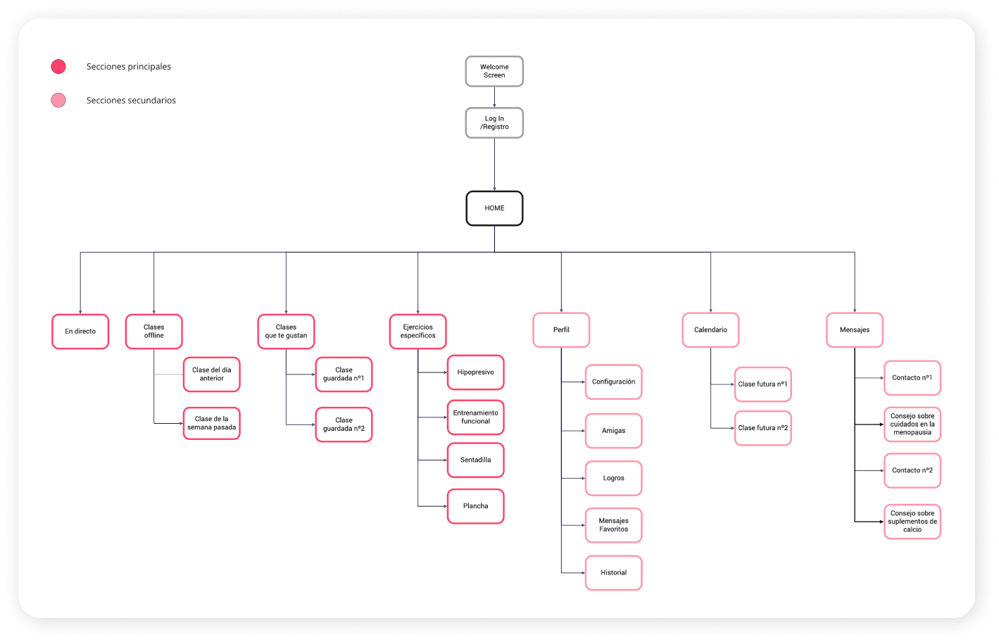
Site map
I created a site map to group all the key functionalities we expect to be in a training and exercise app in different sections, distinguishing between; those primary sections, more accessible and fundamental, and the secondary sections, those also necessary but, more focused on complementing the main ones.
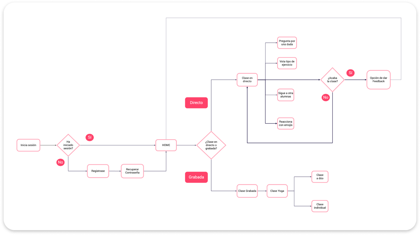
User flow
In conjunction with the site map, I developed the typical flow of a user when opening the app, helping me to better capture the different key steps necessary to access the classes in the fastest and most comfortable way.
Thanks to this, I started working on sketches for different screens that could be inside the app.
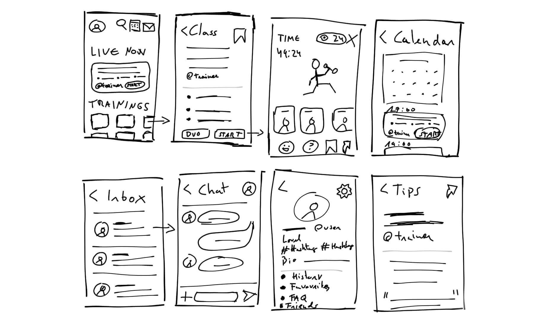
Sketches
I began to capture the different screens of the app. I draw it on paper and pencil to check the best option for usability, trying to maintain a feeling of simplicity and lightness at all times. I wanted to make the access to a class fast and straightforward, without losing sight of other sections such as “Calendar” or “Chats”.
I established the sketches according to a 4.7″ phone, since it is the closest dimension to the usual type of mobile in that age range, apart from being more easily scalable to other devices with a larger screen.
Mid-fi Wireframes
Once I was clear about the different screens that make up the app, I added components and features in a reliable way, prioritizing the functionalities, components and requirements, before the visual part.
I also started to develop the different interactions and modals, completing all the different aspects to achieve a first testable prototype.

Testing
I decided to prototype and test with mid-fi wireframes to discover errors or poorly implemented functionalities, before moving on to the next phase of visual design. Saving this way, time and effort to change any aspect of the product if needed.
Due to the time available and low costs for testing, I carried out a guerrilla test with family and friends from my close environment, as long as they met the criteria defined in the proto-persona. Finally, I carried out the tests with 4 women between 50 and 65 years of age, users who practise or have practised sports in group classes or gyms, and with a medium-low technological level.
Some of the test results were:
- All users confused the “share” button as the “exit” button, as they are more familiar with the “share” icons on Android and Apples devices than those on Instagram.
- All users were unable to understand what is asked of them in the postural exercise animation.
- Most of the users identified the tips as advertising, avoiding reading them and not really understanding their function within the “mailbox” section.
- Some users expressed an obvious rejection when reading the word “menopause” or ailments related to it.
- Some users had trouble pressing various buttons, such as the calendar or chat icons.
Despite the fact that most of the users managed to enjoy the app without critical problems, it was clear that various components of the product had to be rethought. Change some icons in the “classes” section for more common ones, find a new way to integrate the advice in the mailbox, as well as completely change the animation for posture exercises. These were just some of the most urgent fixes for a second iteration.
Iterations
After testing, only a few components were subject to major modifications, such as the size of some icons and the conception of new animation. That left me some time to focus on making some substantial changes that might help users in the “calendar” and “mailbox” sections.
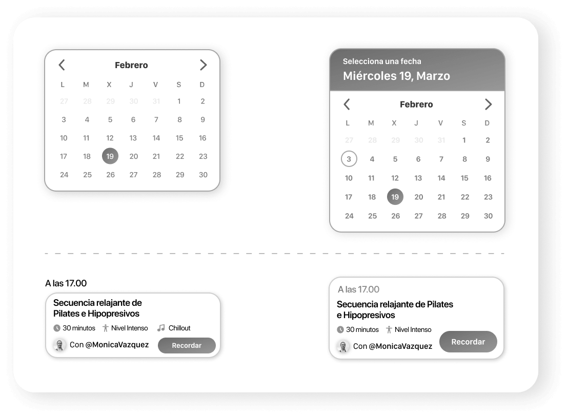
First, the calendar was improved to reflect some useful Material design guidelines for date pickers. In this second revision, a selector was added for the day the user is in, in addition to better highlighting the date selected by the user to check classes.
The second iteration also affected the way in which the time of the classes is shown live, going from appearing as a subtitle to being integrated within the card.
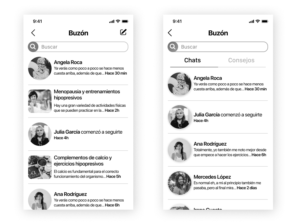
Based on some of the feedback I got in the testing phase, I also altered the “mailbox” screen to better separate the tips from the chats, thus making it clearer what to expect at first glance in each section.
Visual Design
References
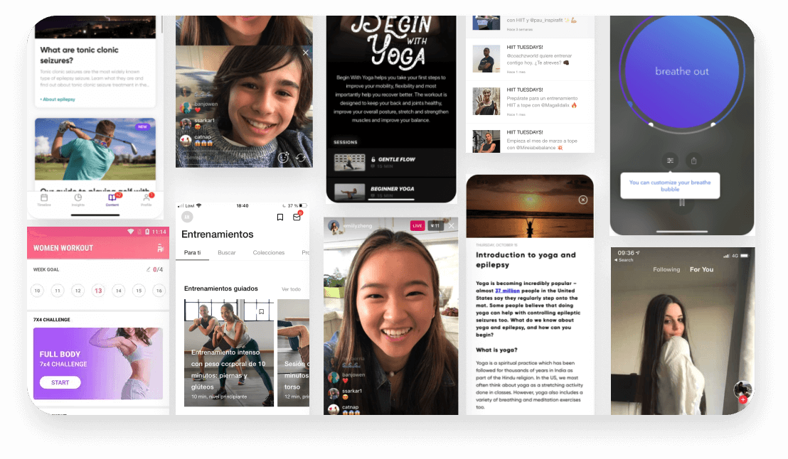
Before starting the visual section, I gathered different references in terms of style and colours from other apps with a theme related to exercise, women’s health, and streaming.
Colors
Being an app exclusively for the female sector, the main colour of the palette had to reflect a colour innately associated with femininity and widely
established in our society. It also has a gradient to show a feeling of evolution and journey, as when a person progresses while exercising.
As a contrast and accent to this colour, light blue works to highlight all those important icons and texts that would otherwise go unnoticed at first glance.
Primary
Rose Gradient
#EC2B5E to #F16E90
Secondary
Pale Rose
#F78192
Secondary
Light Blue
#2BBDCB
Neutral
Teal
#698689
Neutral
Grey
#BDBDBD
Neutral
Light Grey
#EAEAEA
Typography
Since my product was designed for iPhone devices, the best option that came to mind was the San Francisco typeface family. Its small dimensions while guaranteeing readability, integrate enough information in the minimum space without too many problems.
San Francisco Pro / San Francisco Compact Display

Iconography
The icons and badges were chosen and designed to exemplify a simple and pleasing experience to the eye, with rounded corners and edges, with a young and close style. They illustrate concepts that would otherwise be very difficult to achieve, such as those that define the different characteristics of the classes.
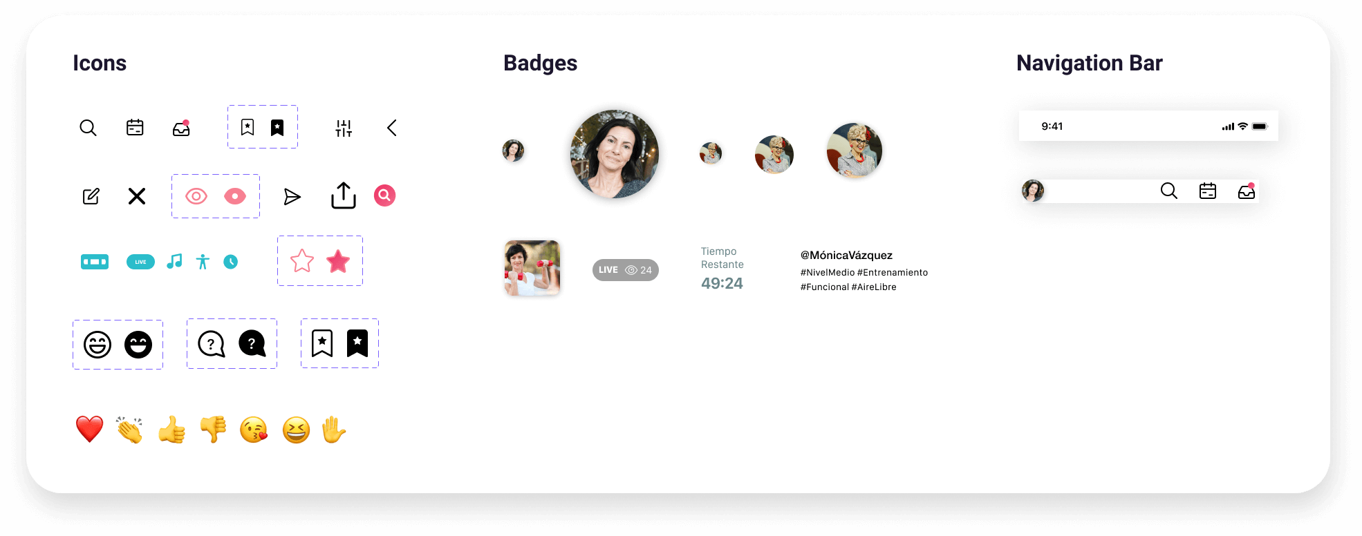
Name & logo
When defining the name, I knew that should be concepts related to “woman” and “exercise”. After a brief brainstorming, I decided that Femfit unifies both ideas quite well, in addition, it can also be extrapolated to other languages. The double “F” has a distinctive touch, being also short, precise and easy to memorize.
To design the logo and branding, I initially tried unsuccessfully to use the two “fs” that coexist in the name, along with a style of soft, close lines, similar to two women exercising. This idea was very suggestive to me, as it is strongly related to the app’s feature to perform exercises with another woman.
Once I began to test the design on mobile screens, I saw that there was too much information and the result was far from being minimalist and simple. Finally, I perfected the idea until I achieved a clean design, achieving with a few added lines an “F” with a classic and friendly style, which easily reflects the concepts established in Femfit: “woman” and “exercise”.
For the lettering, I recovered that definition of “women who exercise together” a bit in a much more subtle way but incorporated it into the name. The curved lines and the typography, which simulates being written by hand, enhance that feeling of femininity and closeness.
Final Product
Product Tour
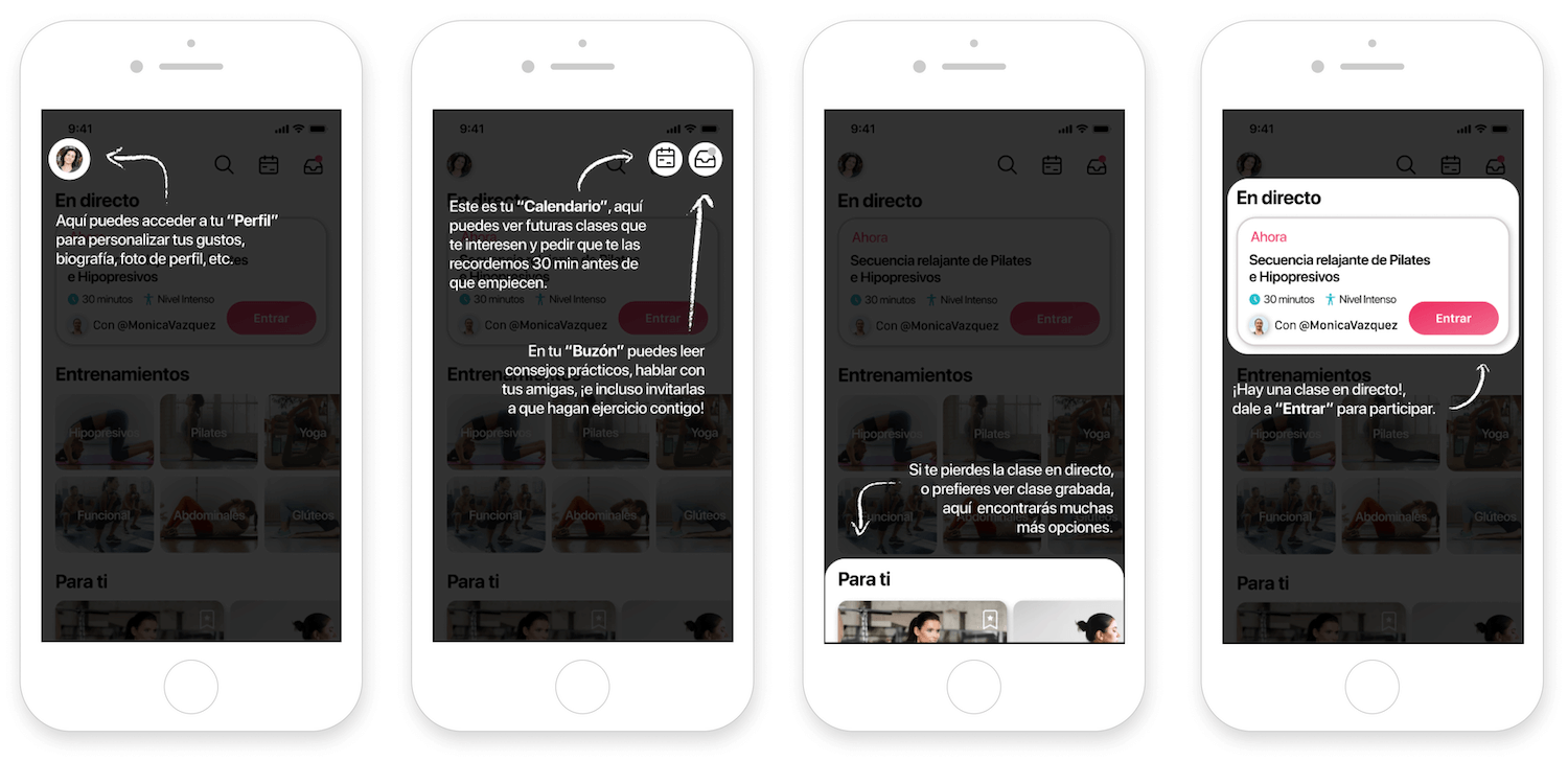
Instead of doing a regular onboarding, I opted for the option of a bubble product tour, as it explained Femfit’s features more concisely, helping to retain more users when starting the experience from the home screen. With 5 simple prompts, the user would already be able to understand all the interface and sections, before entering any available class.
Main Screens
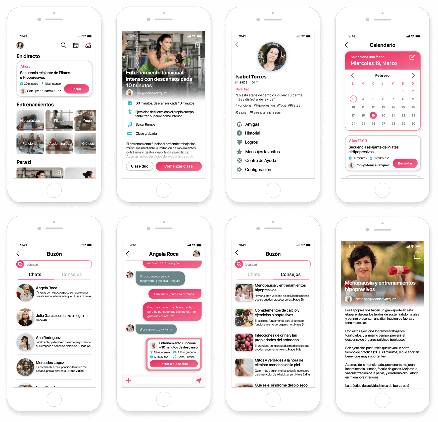
The “home” screen is the main hub of the app, connecting the trainings with other functionalities. In order to not visually block the vertical scroll when selecting a class, I decided to go without a bottom bar, creating a cleaner and lighter screen on reduced dimensions.
In the “calendar” screen, users can check the schedule of live classes that take place on a specific day, and activate a reminder.
In the “profile” section you can edit your profile photo, preferred classes and bio. There are also the expected sections of the configuration area and related utilities such as “trophies” or “history” of past classes.
In “Inbox” we find our contacts and friends to chat, with added functionalities for inviting them to do a “Duo” class.
Inside “Inbox”, we also find the “tips” section, a place where users can find recommendations on how to deal with common issues in the climateric period.
Classes
According to the main stakeholder, most women contact her through Instagram, where they are more active and participatory. That is why I designed the class functionality taking into account the position of the elements within the live streams of that app, with some reminiscents of other applications such as Tik Tok or Snapchat. In this way, the learning curve for the user is minimal and becomes easier to identify all the icons and actions.
In addition to being able to enjoy the classes in horizontal format, users can follow or contact other women in the class by clicking on them.
Another added functionality is the possibility of taking a recorded class together with a friend, performing the exercise on split-screen with her friend and the monitor.
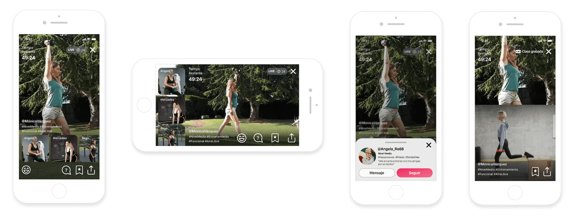
User interactions
Within the classes, we have two types of interactions, divided according to whether they are activated by the users or the monitor.
In this way, users can send an emoji to the teacher, ask her a question about the exercise, or even answer a small survey on what type of training they prefer to do next, being this requirement something that is already a norm in the current exercises of the stakeholder.
Monitor interactions
On the side of the monitor, we have interactions that accompany specific postural or breathing exercises, accompanied by a brief explanation of how to perform the exercise. It is possible that in future iterations this text would disappear since the teacher’s instructions should be sufficient, but to facilitate future tests with users, I decided to leave them in the final prototype.
In postural exercises, the user may be asked to hold the mobile in order to check through the gyroscopes of the same if the inclination and movements are correct.
Conclusion
What I learnt
Designing an application for users within a usually-ignored age range was a real challenge for me when it came to understanding their needs, frustrations and conducts in digital environments. For this, I have always tried to create a product free of friction and barriers. I have focused on what they already know, to create an app that can enhance exercise from home, including some functionalities that are impossible in face-to-face training. I believe I have understood from the first moment the needs of users and stakeholders, defining the main MVP’s to achieve a business opportunity that goes beyond the current circumstances caused by COVID-19.
Future features
- Counter of calories burned and beats per minute: include these and other parameters in live classes while exercising, in addition to integrating the history of calories consumed in the week and/or month. It could also be used so that the monitor could see in real-time the intensity of the exercise in her students. All these thanks to the biometric data of a smartwatch or bracelet.
- Extend the duet exercise function for more people: the following updates should include a function to be able to perform a recorded exercise as a group.
- Group chats: the possibility to create groups of chats, with the functionality of receiving invitations to carry out collective exercises.
- Send to Chromecast: in one of the tests, a user commented that she would like to see the possibility of sending the class to a Chromecast device, in order to be able to watch more comfortably the classes on her TV. Due to the technological level of the users, and by not considering the feature an MVP, it was discarded, but it should take it into account for future iterations.
Final words
I hope this app can help in some way all those women who feel isolated at a crucial stage in their lives and would like to get out of the comfort zone by exercising and taking care of themselves, while finding new friends to help them along the way.
Many thanks to all the users who have contributed through the tests to polish every last detail of this project. Thanks also to Gema Guitérrez and my colleagues for helping me capture and direct all the ideas that I had in my head.
And thank you very much for reading this article!